The Mason Gross Annual MFA show which opened in November this fall, featured work of the first year grad students at the school. While i found, like in many combination shows, a lack of unity in the work, as well as varying levels of interest about them. Some works i found to be impressive or substantial while others i could have done without.
Walking into the gallery, one first encounters Max Cemano's sculpture of a decapitated boar fountain. Not only is this a somewhat shocking and horrifying image in itself, the fountain uses a red liquid that gives the impression of blood. The stream flows into a large black oil drum. I had seen Max's original idea for this when it was still in sketch form, and i enjoyed seeing the changes made during its realization. He chose to leave certain parts of the inner workings of the fountain visible in its construction. The back shows the tubing for the 'blood' and in the boars mouth, one can also see the tube, and the attachment spout. What i found to be most interesting about his installation was how it changed over time. from the time the show was installed, to the opening reception, the constant flow of the fountain had produced a splatter effect of dried 'blood' on the floor around the sculpture. this added the element of time and its long term effects that would not have been noticeable in the original viewing. i do not know if this was something the artist had anticipated, but i would be curious to learn his feelings on the matter.
Max also had another sculpture, a cast of a shark that he then painted in a design similar to art on old bomber planes in World War II. He has used this design on other works of his that i have seen in his studio. He has a collection of butterflies that have been recolored with the fame grinning pattern.
These definitely drew attention, but they also were made using subdued colors and therefore could exist in the center of the room and attract attention and be in coexistence with the rest of the work on the walls. The other work used brighter colors and different styles so it worked well.
In one of the back rooms is an installation of Ryan Soper's. This is made out of the building material Tyvek and is a general 'tent' form that can be entered by the viewer. inside, are a light and strange objects constructed of various plastic materials. These also involve zippers and Velcro and use bright colors: red, yellow. With the blue lettering on the white exterior and the black detailing on the objects inside, it is visually pleasing with the simple primary colors and black and white. this was interesting to me, but it seems like it's almost trying to hard or something. it reads to me like it was made to be somewhat of an enigma and have a certain 'look' that can be seen in some contemporary sculptor's work. It did work well in the room with the other installation, as it was contained in itself so they could be in their own right in spite of the close proximity.
Finally, in the video room was the video and installation by Stefanos Milkidis. His piece was a large cinder block tunnel, in the low lit room. Upon first encountering it, the viewer would think that it is a solid block, but the video shows footage taken from what appears to be the top of the 'block' and one can see that not only is there hollow space in the middle, but also, in the videos are people contained in the structure. This at first can prompt the viewer to question whether anyone is currently trapped inside, as the blocks are tall enough that without the aide of a ladder, you couldn't check. I found it have a cold, hard feel it. the low lighting and the gray, rough bricks had a physical presence. i felt, contained, small and kind of helpless. i felt empathy for the figures inside, as there's no audio on the video so you can't get a feel for how the people contained feel. The blocks have a weight to them, besides there physical weight. their towering presence in combination with the knowledge that people have been contained inside gives it that.
I really enjoyed the installation in the first room to the left. it had beautiful colors as well as pleasing forms. the flow of stones on the floor as well as the udder-like plunger hanging piece forced the viewer to interact with the room around them. I also enjoyed the work in the room before the video room. these were everyday farming tools, a shovel and a pitchfork, but juxtaposed with alterations. The pitchfork's 'forks' were extended an extra couple of feet, to the point that the forks lie flat on the ground, and the wooden handle is supported in space. the shovel, installed in the corner, has a handle made of a fluorescent light tube. These remind me of work by Charles Ray [the pitchfork] and also Dan Flavin [the shovel].
Friday, December 10, 2010
Tuesday, November 23, 2010
work at home
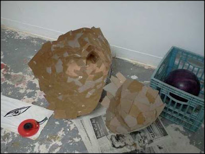
over the last week or so, i had been keeping myself busy at home when i couldn't get to livingston to work in my studio. in doing so, i started to create these strange amorphous cardboard structures, composed simply of cut cardboard and hot glue. i'm not sure what my plans for them are at the moment, but i would either like to join them and create one very large form or make several forms of different sizes. for this process, i have not been trying to direct the process, but rather, to let the process direct what i create. i'm adding to them just as i have been since i began them, adding cardboard to areas that need to be built up, with a piece that seems to fit well from the pieces i had cut beforehand.
i moved them to LAB over the weekend, as they are growing exponentially and wanted to get them to an area where i could better work on them, before i couldn't transport them easily. i also have access to better hot glue guns there, to expedite the process.
design and observations
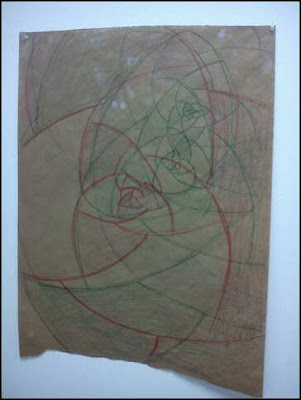
i have also been drawing/sketching/looking at/thinking about patterns. whether created or found in nature, abstract, geometric, or composed of fractals. a lot of these have to do with expanding and contracting, as well as ratios, specifically (fractal-wise) concerning the golden ratio or golden spiral.

i also tend to find inspiration in things i see in my travels. yesterday i came across this on livingston and had to document it. it seemed to me to be straight out of dr. suess's the lorax.
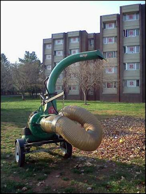


i also tend to find inspiration in things i see in my travels. yesterday i came across this on livingston and had to document it. it seemed to me to be straight out of dr. suess's the lorax.

studio workk
after losing my phone, and all the pictures of my current studio projects, here's a look at some of things i've been getting into lately.
i have been making plaster casts, as well as casting resin. i started casting the inside of plastic bags in plaster, using a hollow cast method. these resulted in very fragile, delicate pieces.

i also tried this process with resin; one an open bag form which took much layering and time to build up, the other, a much smaller experiment which did not turn out as i had expected, but still yielded interesting results.
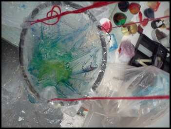

recently, i decided to try and combine the two materials. some of these experiments simply entailed coating plaster in a layer of resin, and also playing with resin dyes on both the plaster and the resin itself to play with color as well as form. i have also been submerging/encasing plaster casts in larger casts of resin.
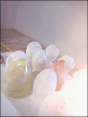


i then decided to play with mixing both wet plaster and wet resin together to see how they affected one another. the previous plaster/resin pieces used set plaster and wet resin.
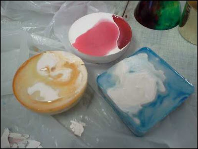

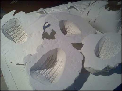
another plaster/resin experiment involved using rubber/latex pieces to produce casts, as the materials do not stick to one another once set. here are some of these casts.
i have been making plaster casts, as well as casting resin. i started casting the inside of plastic bags in plaster, using a hollow cast method. these resulted in very fragile, delicate pieces.

i also tried this process with resin; one an open bag form which took much layering and time to build up, the other, a much smaller experiment which did not turn out as i had expected, but still yielded interesting results.


recently, i decided to try and combine the two materials. some of these experiments simply entailed coating plaster in a layer of resin, and also playing with resin dyes on both the plaster and the resin itself to play with color as well as form. i have also been submerging/encasing plaster casts in larger casts of resin.


i then decided to play with mixing both wet plaster and wet resin together to see how they affected one another. the previous plaster/resin pieces used set plaster and wet resin.


another plaster/resin experiment involved using rubber/latex pieces to produce casts, as the materials do not stick to one another once set. here are some of these casts.

Tuesday, September 21, 2010
WLCMBCK
For the start of the new semester, Mason Gross featured a show in their downstairs gallery, WLCM BCK. The play on words and letters in the title pronounced 'welcome back' was nice twist that also seems to comment on pop culture, and the world of the internet and text messaging. The show featured graduate students, teachers, and staff from Mason Gross, as well as featuring two artists. The first featured artist, Jim Toia had two installation pieces, that dealt with video, sound and nature, entitled Dissolving Gardens. The second artist, Lyda Craig, was a Mason Gross alum and her show, Intimate Observations, was a tribute to her.
As the rest of the show was made up of pieces from a wide variety of artists, and the show had no theme, it is hard to talk about the show as a whole except to say if the placement was done in poor judgment or not. As a whole I found the show to be interesting. I did not however find that it lent itself to going in any particular order. Knowing the gallery from past experience, I meandered at my own pace, following whatever piece struck my attention.
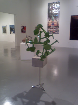
Patrick Strzelec
Syn 2010
Cast Aluminum, Limestone, Stainless Steel
4'x 3'x 3'
The first piece I was drawn to was Patrick Strzelec's "Syn". Both its positioning in the first room, as well as its color and aesthetic appeal drew me to this sculpture. I enjoyed the way this piece played off of Gary Khuen's piece. These sculptures are reminiscent of each other and the stark contrast between material choices and the bright green color Patrick chose really animate the main room.

Barbara Madsen
Endless 2010
Mixed Media
Dimensions Variable
The next piece I literally followed was the piece "endless" by Barbara Madsen. This piece starts in the main room of the gallery and appears to go through the wall. However, on the other side of the wall there is nothing. The rest of the piece is a good 15 feet away on a wall not connected to the original. This piece is visually striking with its hot pink colored tubing,shiny metal attachments, and its clean, white, smooth construction. There is also the captivating doors on the piece inviting the viewer to look in through them, as well as the open view from above, which reveals the 'pattered' floor. The smaller piece seems almost as if it could be put through the doors of the other piece, if it could simply melt backward through the wall. There is innate curiosity attached to this piece as you follow it through the gallery. Even to find the tag, one must search on another wall entirely. I appreciated how this was installed and I wonder if there were any specific instructions to be followed when it was installed or perhaps if Barb was there herself. One thing that was done in its installation was that both parts are maintained at the same height on the walls, and are therefore both viewed in the same way. I feel that depending on the artist's intention, it could be worth trying out to change the heights of the different sections. It is quite fun nonetheless and depending on where it was installed, the piece could be constantly changing.

Damian Catera
EOH v.v1 2010
Video
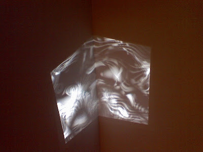
As I Made my way in the back corner of the gallery, I encountered two video installations. While both were certainly captivating, I felt specifically drawn to the projected piece. This used a distorted projection of music notes with accompanying sounds. I honestly was confused as to which piece was which and even now, am only guessing by the titles and style of the artists, Damian Catera and Ardele Lister. The second piece in the room was shown on a flat screen and was colorful television static in a continuous loop. This was also accompanied by sounds, but static sounds. In this way the two pieces significantly played off one another. One could argue either way if they help enhance the pieces or take away from them. Certainly the static piece 'does its job' in the sense that static makes people annoyed and it can be annoying to hear the crackling sounds over and over. However, having the sound in the room helps the viewer pay closer attention to the sounds in Damian's piece. Either way, the two certainly interact and are both visually and audibly stimulating and interesting.
Wendy White
CNC 2010
Acrylic on Canvas
37.5" x 43"
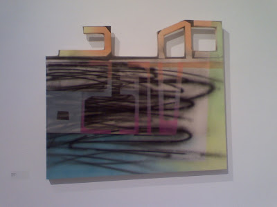
Wendy White's piece hadn't initially caught my attention but as I did come across it later, it struck me as interesting. She had modified the canvas to have extraneous shapes. In fact shapes that spelled out CNC, the title of the painting, but in the reverse. The work seems to be either airbrushed or dry brushed onto the canvas in a way that depicts spray paint. In fact, the entire piece had struck me right off the bat as having a direct graffiti feel to it. The colors are bright and there are graphic qualities to it. My only criticism of it, is that the hanging of this painting could have been better suited. It seemed to get lost in the corner where it was hung. Although, it was certainly a piece much different than a lot of the other work, and therefore did not necessarily fit in better anywhere else in the show.
As the rest of the show was made up of pieces from a wide variety of artists, and the show had no theme, it is hard to talk about the show as a whole except to say if the placement was done in poor judgment or not. As a whole I found the show to be interesting. I did not however find that it lent itself to going in any particular order. Knowing the gallery from past experience, I meandered at my own pace, following whatever piece struck my attention.

Patrick Strzelec
Syn 2010
Cast Aluminum, Limestone, Stainless Steel
4'x 3'x 3'
The first piece I was drawn to was Patrick Strzelec's "Syn". Both its positioning in the first room, as well as its color and aesthetic appeal drew me to this sculpture. I enjoyed the way this piece played off of Gary Khuen's piece. These sculptures are reminiscent of each other and the stark contrast between material choices and the bright green color Patrick chose really animate the main room.

Barbara Madsen
Endless 2010
Mixed Media
Dimensions Variable
The next piece I literally followed was the piece "endless" by Barbara Madsen. This piece starts in the main room of the gallery and appears to go through the wall. However, on the other side of the wall there is nothing. The rest of the piece is a good 15 feet away on a wall not connected to the original. This piece is visually striking with its hot pink colored tubing,shiny metal attachments, and its clean, white, smooth construction. There is also the captivating doors on the piece inviting the viewer to look in through them, as well as the open view from above, which reveals the 'pattered' floor. The smaller piece seems almost as if it could be put through the doors of the other piece, if it could simply melt backward through the wall. There is innate curiosity attached to this piece as you follow it through the gallery. Even to find the tag, one must search on another wall entirely. I appreciated how this was installed and I wonder if there were any specific instructions to be followed when it was installed or perhaps if Barb was there herself. One thing that was done in its installation was that both parts are maintained at the same height on the walls, and are therefore both viewed in the same way. I feel that depending on the artist's intention, it could be worth trying out to change the heights of the different sections. It is quite fun nonetheless and depending on where it was installed, the piece could be constantly changing.


Damian Catera
EOH v.v1 2010
Video
As I Made my way in the back corner of the gallery, I encountered two video installations. While both were certainly captivating, I felt specifically drawn to the projected piece. This used a distorted projection of music notes with accompanying sounds. I honestly was confused as to which piece was which and even now, am only guessing by the titles and style of the artists, Damian Catera and Ardele Lister. The second piece in the room was shown on a flat screen and was colorful television static in a continuous loop. This was also accompanied by sounds, but static sounds. In this way the two pieces significantly played off one another. One could argue either way if they help enhance the pieces or take away from them. Certainly the static piece 'does its job' in the sense that static makes people annoyed and it can be annoying to hear the crackling sounds over and over. However, having the sound in the room helps the viewer pay closer attention to the sounds in Damian's piece. Either way, the two certainly interact and are both visually and audibly stimulating and interesting.

Wendy White
CNC 2010
Acrylic on Canvas
37.5" x 43"
Wendy White's piece hadn't initially caught my attention but as I did come across it later, it struck me as interesting. She had modified the canvas to have extraneous shapes. In fact shapes that spelled out CNC, the title of the painting, but in the reverse. The work seems to be either airbrushed or dry brushed onto the canvas in a way that depicts spray paint. In fact, the entire piece had struck me right off the bat as having a direct graffiti feel to it. The colors are bright and there are graphic qualities to it. My only criticism of it, is that the hanging of this painting could have been better suited. It seemed to get lost in the corner where it was hung. Although, it was certainly a piece much different than a lot of the other work, and therefore did not necessarily fit in better anywhere else in the show.
Thursday, September 16, 2010
An Interview with Photographer, Nikki Fenton
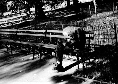
I recently had the opportunity to interview Nikki Fenton, a photographer who attends Mason Gross School of Arts at Rutgers University. She minors in Psychology which recently has helped her discover a new direction for her photography. As a photographer, finding your own style and subject matter can be difficult. Her last few years at Mason Gross has helped her try new methods and learn more to better inform her own work. She really has an artistic eye, which is evident in her framing, lighting, and subject matter.
Shub Schirmer: Nikki, what have you chosen to concentrate in?
Nikki Fenton: I am a photography concentration , with an extremely strong interest in the study of the human mind. I minor in psychology and plan on going to graduate school for art therapy.
S: How would you describe your older work and how did it transform into the work you're doing now?
N: In the past I have always tried to capture multiple textures and landscapes of abandonment. Unclear of the point I was trying to get across, I finally realized there was a strong connection between the psychological standpoint of things. Coming to this conclusion I drifted away from photographing the decay and still standing matter and began to explore the world of people.
S: So, tell me about what you've been working on more recently.
N: My most recent series of works consist of the documentation of multiple psychological disorders that hit close to home within my personal life. These photographs represent individuals in my family or friends as well as their homes and personal belongings. They are taken to show (indirectly at times) their personal struggles with their illnesses along with various coping strategies and habits to get them through their daily routines.
S: It seems that your interest in psychology has left a profound mark on your work. What specifically would you say has changed from this?
N: Being a psychology minor, my art has shifted from photographing groups of people and objects to this more concentrated prospect.
S: Could you explain these newer series and what you were trying to achieve with them?
Dawn Series (January 2010)
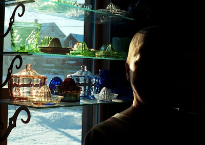
N: This series represents a struggle with breast cancer and ways the subject overcomes the illness. Many people use multiple coping mechanisms while they are sick. Dawn uses her time to focus on the objects she has in her home through obsessive compulsive collecting. The portraits shot of her are in black and white except for the larger image that emphasizes the beauty in her glass collection. It is ironic that a disorder society looks down upon can morph into a subject for healing when paired up with cancer. This series represents the power to overcome an almost impossible to ignore disease, which is saved by a common disorder many people would consider harmful.
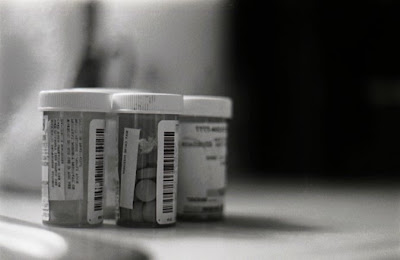
Dad Series (October 2009- February 2010)
This series documents my father’s life coinciding with prescription medication. After becoming ill in 2004 and losing his job his body runs off of these multiple medications to properly function both mentally and physically. With the passing of time these pills have become a crutch in his life. At most these photographs are a series of portraits of my father through his medications.
Mercer St. Series (March 2010)
This series portrays a haunting space that has been a burden to the individuals who own it and live in it. Not only can a person have a series of mental illnesses but a home can encase the struggle. By presenting the public with these images I hope those who view them feel a sense of containment and need for escape. Shot in an uncomfortable space, these photos provide an insight into the space and the various emotions and moods which have lived inside of it over a course of time.
S: Where do you get your influences from?
N: My inspiration comes from the work of Nan Golden, Mary Ellen Mark, and Diane Arbus.
S: Where do you see your thesis going? Do you want to continue exploring the psychological nature of people?
N: For my senior thesis I am considering visiting a mental hospital and documenting the individuals who are residing there for his or her own disorders. The work will focus on the interest in my subjects healing and coping strategies as well as their treatments. By recognizing that every patient is a person with a life can bring an understanding to the outside world and art in itself as a way of healing. I am also considering incorporating some ink blot drawings with the photographs.

Monday, September 13, 2010
Water^2: My Own Approach to Curating


Left
Hans Haacke
American (b. Colongne, 1936)
Condensation Cube
Plexiglas and distilled water
Edition 5 of 5, 30 x 30 x 30 in.
Right
Janine Antoni
American (b. Bahamas, 1964) and
Paul Ramirez Jonas
American (b. Honduras, 1965)
Always New, Always Familiar 2000
Video projection, dimensions variable
Edition of two and one artist's proof


Above
Atul Bhalla
Indian (b. 1964)
Immersions 2008
Installation of water, glass cases,
cast sand, and silt, dimensions variable
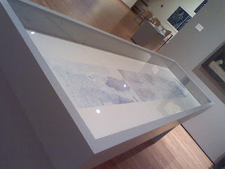

Left
Nancy Graves
American (1939-1995)
Bottom of the Pacific Ocean Between California and the Hawaiian Islands - Sub Cable Survey 1891-92 1972
Goauche on paper, 22 x 90 in.
Right
Atul Bhalla
Indian (b.1964)
Piaus 2006
20 photographs individually framed
Each 17 x 20 in.
The works I have chosen to include in my show, were works that caught my eye throughout the Water show, but also ones that use different ways to express water. Also, the way I would lay them out, would hopefully create an interesting space with interesting play between the pieces.
I would set them up in a rectangular room with Antoni and Ramiraz Jonas's video on one end, projecting from above into an alcove, and Bhalla's Piaus on the other, with Bhalla's Immersions set about between the two. On the other two sides of Immersions I would set up Graves's and Haacke's pieces, both with ample space to move about them, as well as space to move about and through Immersions. I would follow Donna's example and set it up in a blue room, probably more on the teal side. i would hope that the video projection would cast light about the room and create an interesting space.
Drip Drop: Water Exhibit at the Zimmerli
The current exhibit at the Zimmerli Art Museum, entitled Water, first sparked my interest when I caught a glimpse of Ross Cisneros’s piece, Ice and Ark, hanging from the ceiling in passing. From there I was led downstairs and into the exhibit that had to do with water in all its elements and ways it is understood in the art community. The Curator, Donna Gustafson, put the show together with works from the Zimmerli’s personal collections and also from work lent by outside sources.
I really enjoyed how the first room with Hans Haacke’s Consensation Cube worked together with all of the pieces in conversation with each other, including Maya Lin’s Dew Point. However, I think that for maximum impact, the lighting on Lin’s piece could have been much more dramatic, with more reflection on the wall. The next section of the gallery also felt a bit off to me. Donna had explained her reasoning for placing fairly recent work, with older, more traditional landscapes scattered about the modern. I can understand that she may have had difficulty finding a place for the older landscapes or perhaps she was just trying it to see how it fared, but I personally think it was too far of a stretch and they seemed out of place. In fact, I think they actually took away from the modern pieces they were near, such as Maya Lin’s Pin River – Hudson, Yvonne Jacquette’s Hudson River Diptych, and Nancy Graves’ Bottom of the Pacific Ocean Between California and the Hawaiian Islands-Sub Cable Survey, 1891-92.
I did enjoy the men in boats/women in the waves room. I found these pieces to go together in a loose way that was made stronger by the pairings. Gustafon paid strict attention to the wall color throughout the gallery, but in this room I think she was happily surprised to see that the wall color transitioned as it went into the next room. This was due to the light from the video projection, Janine Antoni and Paul Ramirez Jonas’s Always New, Always Familiar, reflecting onto the wall, altering its appearance.
Continuing in the gallery, I felt that the second and third video rooms were almost too easy to ignore as I went through the room towards the eye-catching piece, Immersions, by Atul Bhalla. But on second glance I did go back and see them. I especially enjoyed Bhalla’s Immersions for being able to walk around and through the different glass cases and really inspect them. The last room, with Immersions, I thought went together well, as the layout had a strong grid-like pattern to it. Both of Bhalla’s pieces and Diane Neumaier’s installation of Fountains from the Fountains and Urns Project all have the strong grid in their set up.
Subscribe to:
Comments (Atom)